ZeuZ Platform 202604

Welcome to the April 2026 release of the ZeuZ platform! This update introduces deep observability with Grafana & Prometheus integration, a fully revamped Dashboard, the new UI Mockup Generator addon for Agentic Implement, a redesigned Milestone View with Risk/Complexity/Velocity insights, Log Export & Share, expanded onboarding platforms, a new flexible Test Case Edit page, the Linux Inspector, plus important workflow enhancements and bug fixes.
🚀 New Features
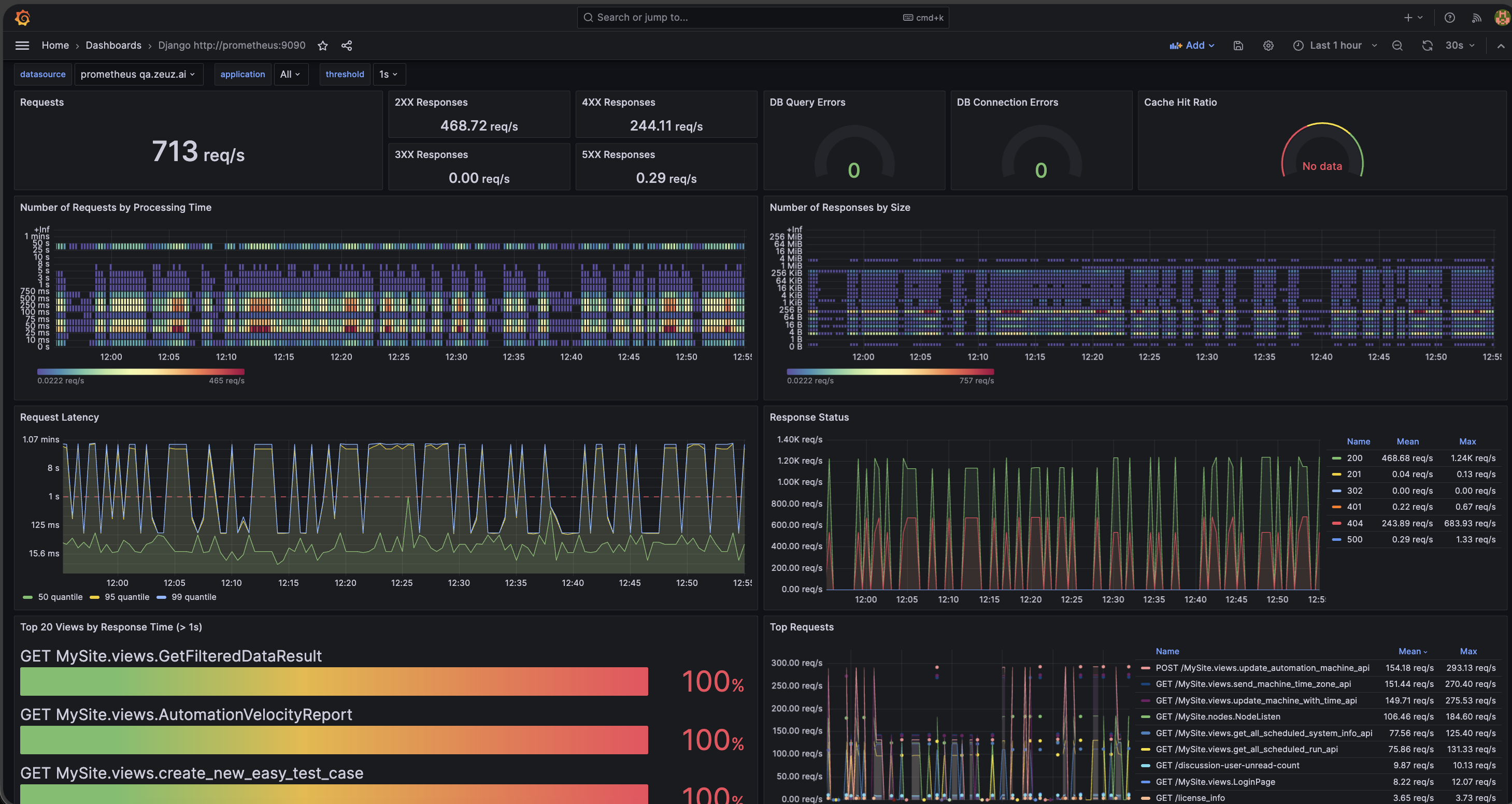
- Grafana & Prometheus Integration: Added secure integration with Grafana and Prometheus. Monitor servers, analyze metrics, and create custom dashboards in Grafana.
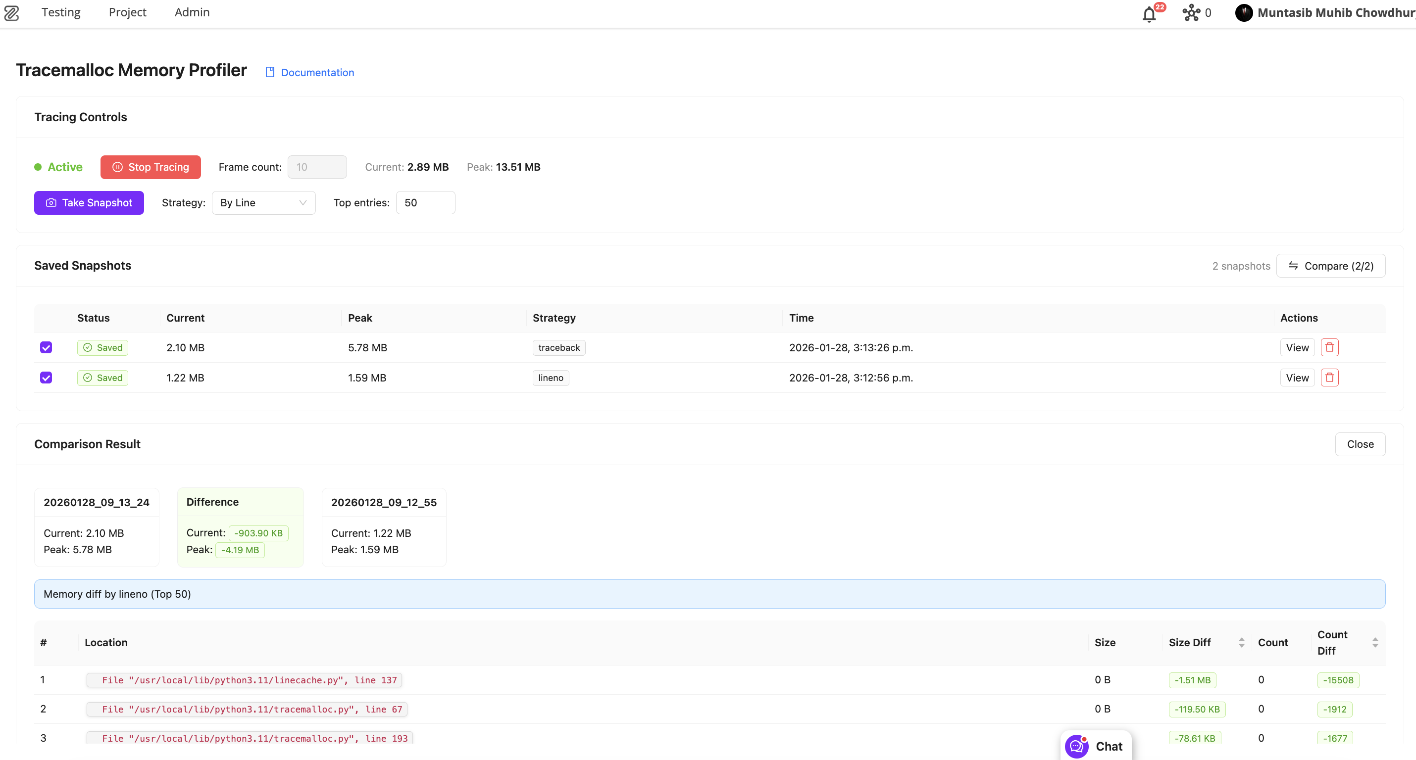
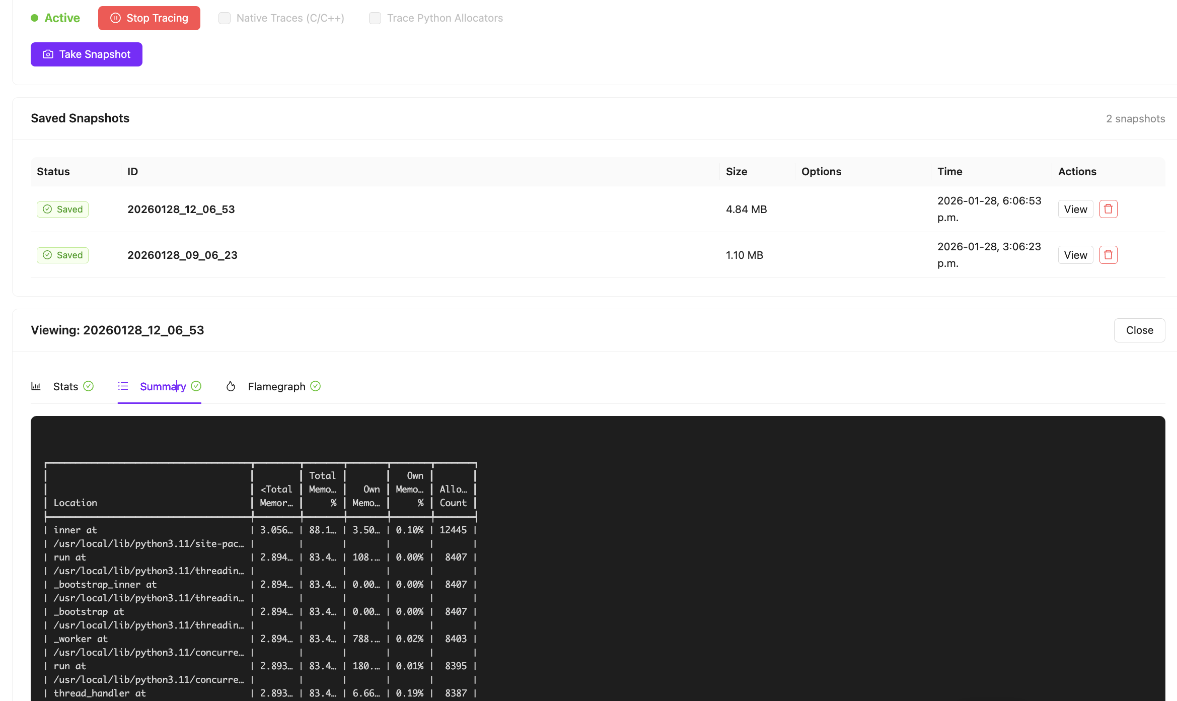
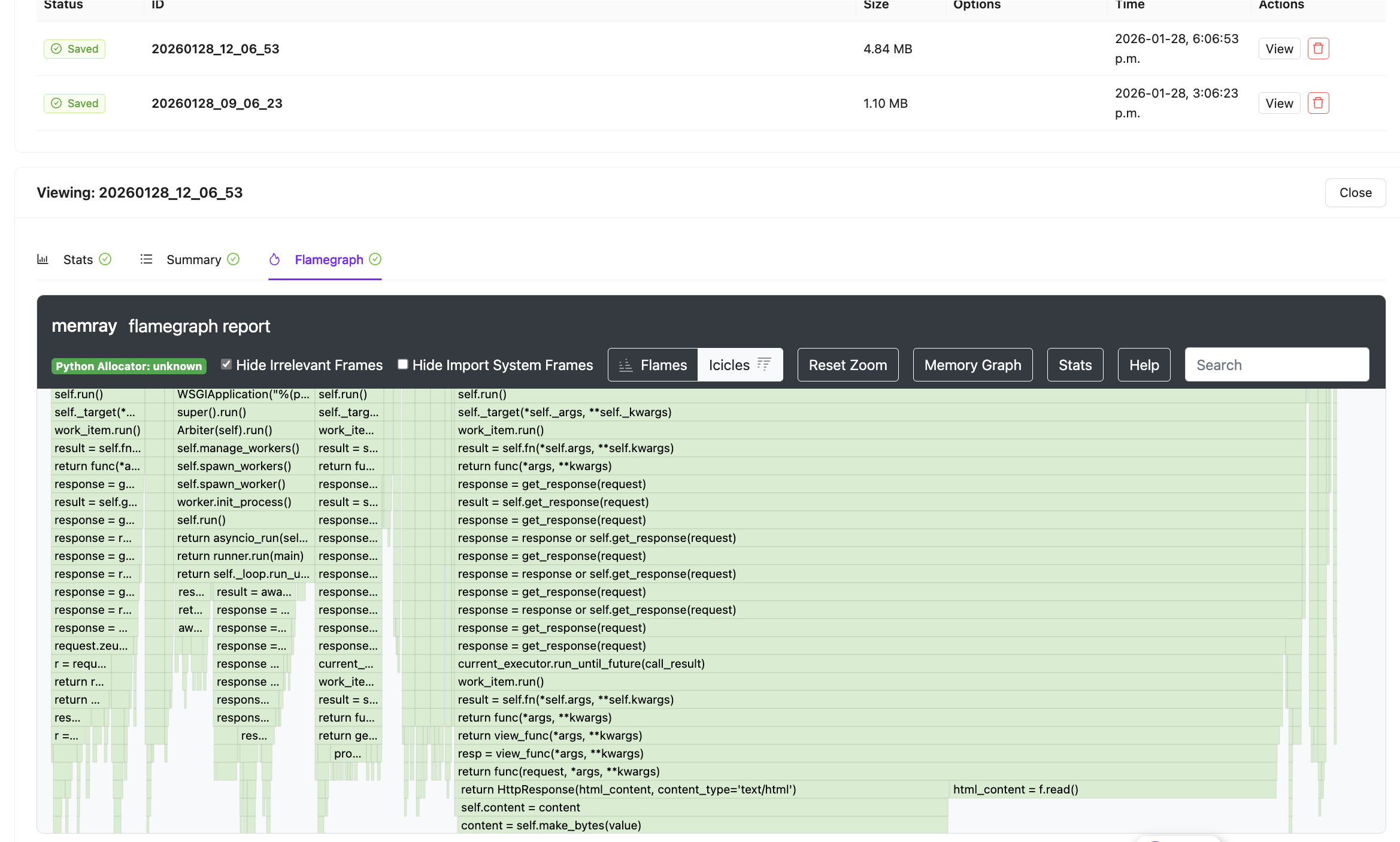
- Django Memory Profiling: Introduced memory profiling within Django to help identify functions responsible for high memory usage.
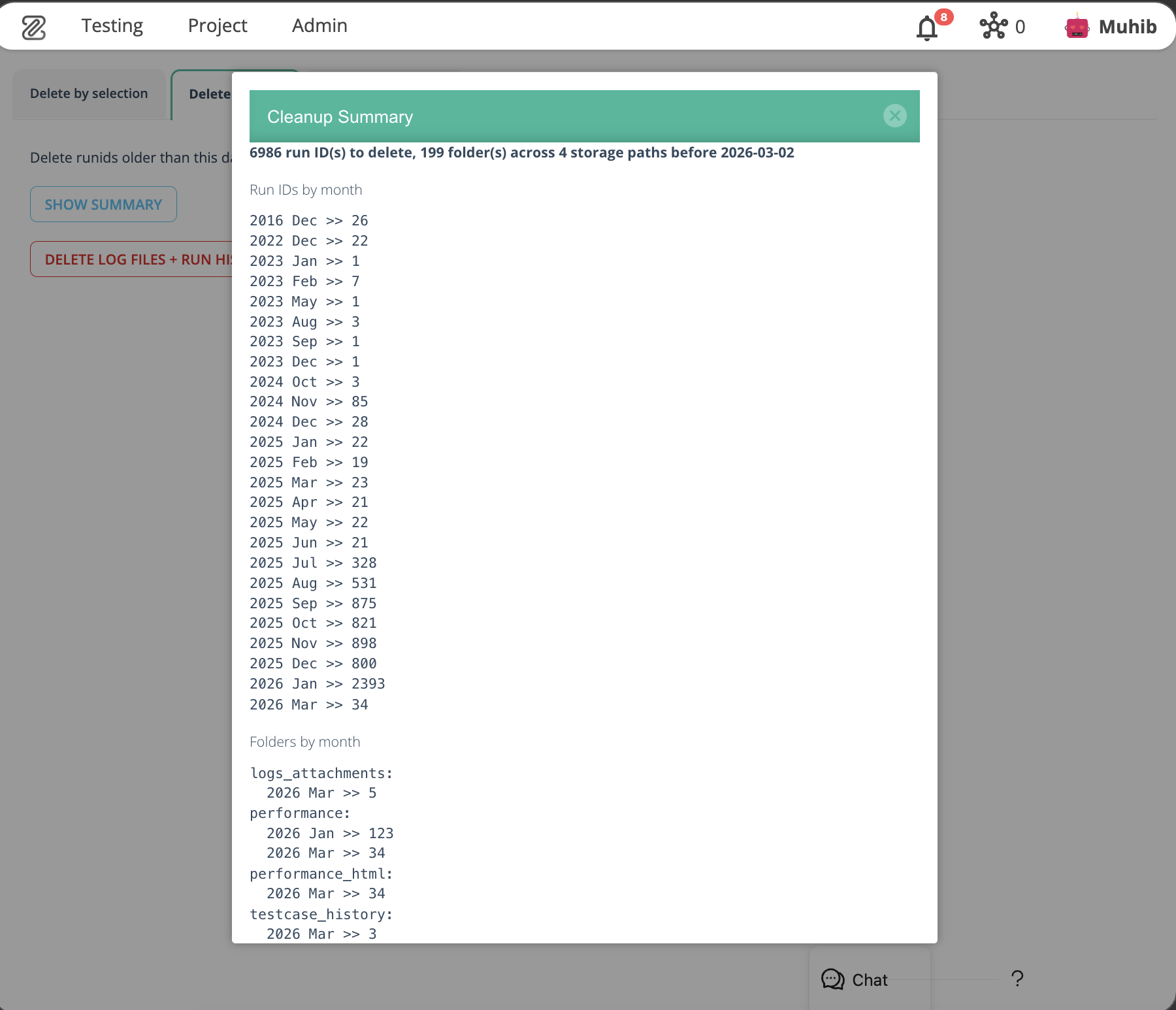
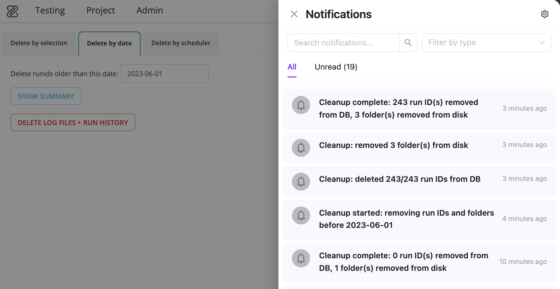
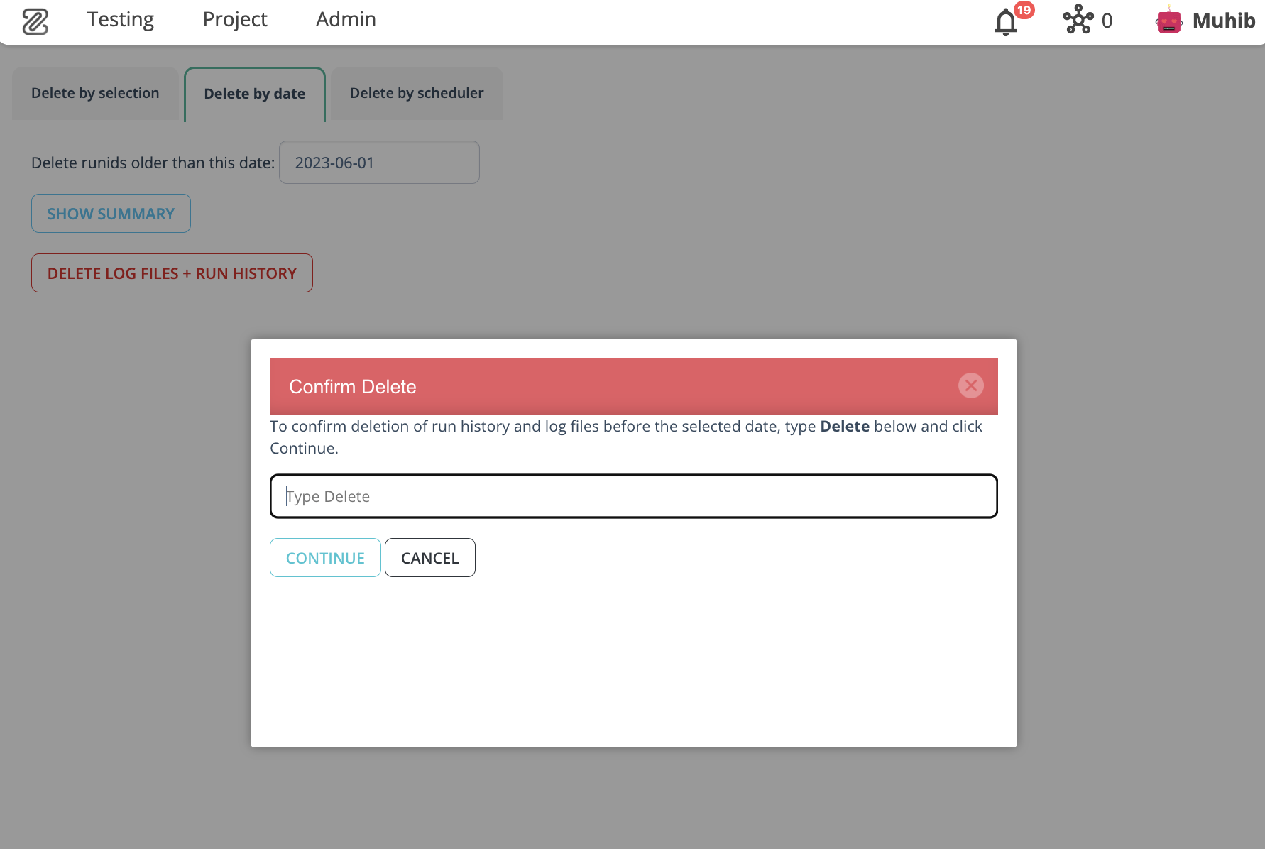
- Run ID Cleanup by Date: Automatically remove run IDs older than a specified date from the database and file storage. Includes summary, confirmation prompt, and post-cleanup notification.
- Dashboard's New Look: Revamped dashboard with grid-based layout, customization menu, drag-and-drop reordering, and new project management/team insight widgets.
- UI Mockup Generator (New Addon for Agentic Implement): AI-driven mockup generation with design variants, iterative refinement, and seamless handoff to Agentic Implement.
- Milestone View's New Look: Redesigned Milestone View with Status View, Developer/QA View, Complexity, Risk, Global Risk, and Velocity concepts.
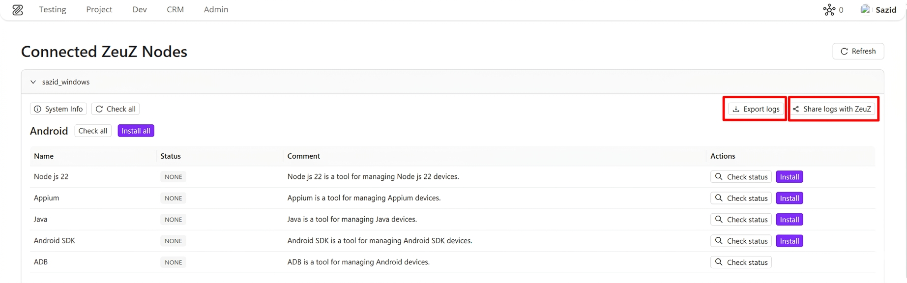
- Log Export & Share (Phase 1): Unified log download and share experience across onboarding setup cards and connected ZeuZ Nodes setup view.
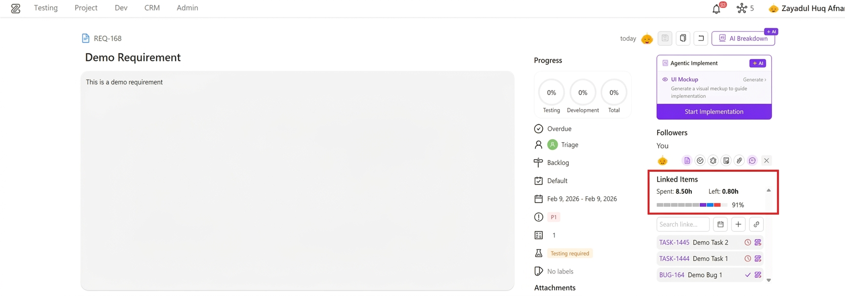
- Time Summary for Linked Items in Requirements: New aggregated spent/remaining time view with structured worklog breakdown and segmented progress visualization.
- Onboarding Platform Expansion: Onboarding now supports API, Windows, Database, Security, and Accessibility testing, with ZAI Chatbot for Android, Web, iOS, Windows, and API testing.
- POD Management System Page: Introduced Product Oriented Delivery (POD) Management System for cross-functional team organization.
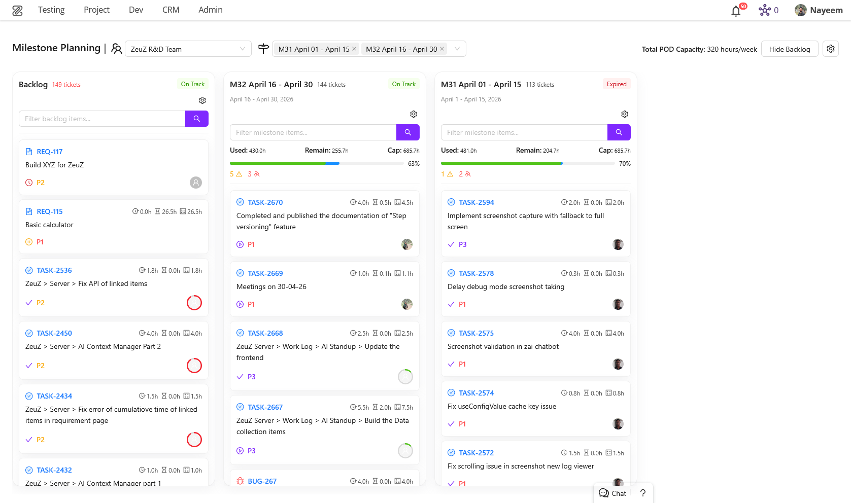
- Milestone Planning Page: New page for efficient milestone and ticket management with drag-and-drop interface.
- Team Worklog Page (Redesigned): Fully redesigned worklog experience with multi-user selection, bar charts, ticket slider, and key information cards.
- New Testcase Edit Page: Completely revamped Test Case Edit page with a customizable, drag-and-drop workspace powered by
flexlayout-react. - Linux Inspector (New): Dedicated Linux Inspector panel for building and debugging automated tests for Linux desktop applications.
🐛 Bug Fixes
- Email Notification URL Issue: Fixed a bug where URLs were incorrectly set to localhost.
- Frontend Multi-Selector Issue: Resolved an issue where multi-selector components broke after a package update.
- Fixed UI styling issues in User Management page.
- Resolved auto-save issues in Project Management → Ticket title and Ticket description.
- Fixed
Cannot read properties of undefinederrors in History page, Set pages (ECharts resize listeners), and Test case edit page (VP selector). - AI & Execution Fixes: Fixed WebSocket errors after client disconnects, user query truncation, AI execution error handling stability, missing
session_completeevents, and GraphQL context URL fetching issue.
🛠️ Improvements
- Performance Improvements: Optimized key APIs and database tables to reduce response latency.
- Modernized Follower UI in Project Management.
- AI Chatbot & Planning: Optional AI plan review flow, interactive review actions, iterative feedback loop, persistent docs search visibility, smarter replanning, conditional DOM fetching with
skip_dom, improved WebSocket stability, markdown rendering, chatbot UI, and stop-generation visibility. - XPath & Performance: Improved XPath variable handling consistency, optimized sibling property retrieval, and reduced unnecessary DOM operations.
- Node Selector: Improved node auto-selection and persistence behavior, simplified configuration handling for reusable integrations.
1. Grafana & Prometheus Integration
Added secure integration with Grafana and Prometheus. Monitor servers, analyze metrics, and create custom dashboards in Grafana.
2. Django Memory Profiling
Introduced memory profiling within Django to help identify functions responsible for high memory usage.
3. Run ID Cleanup by Date
Automatically remove run IDs older than a specified date from the database and file storage. Includes summary, confirmation prompt, and post-cleanup notification.
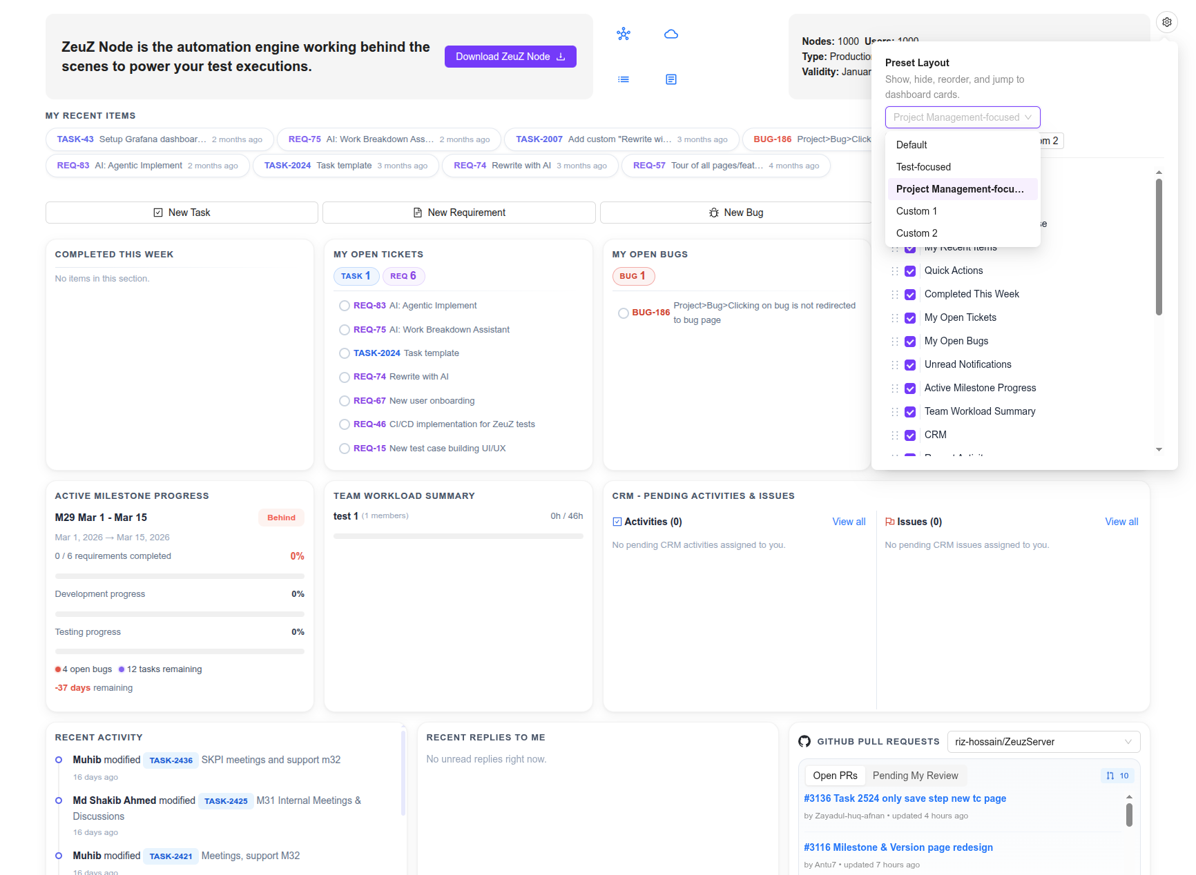
4. Dashboard's New Look
The dashboard has been revamped to bring much more useful info front-and-center so that you can see most of the valuable details about your project and testing right from the homepage.
New Layout & Customization
- Grid-Based Interface: Transitioned to a structured grid layout with consistent card sizing, spacing, and subtle borders for a more stable visual experience.
- Layout Customization: Introduced a new customization menu allowing users to toggle widget visibility, reorder cards via drag-and-drop, and save custom layout presets.
- Testing Widgets: Existing testing-related widgets have been refreshed to match the new visual system.
Project Management & Team Insights
- New Personal Widgets: Added dedicated cards for My Recent Items, Completed This Week, and Open Tickets/Bugs.
- Team Activity: Introduced Recent Team/Project Activity and Recent Replies to track discussions and project-wide updates.
- Milestone Tracking: Added an Active Milestone Progress card to monitor development, testing, and time remaining for current milestones.
- Resource Management: New Team Workload Summary widget comparing logged vs. expected pod work hours.
- Feature Discovery: Added a rotating tips widget to highlight platform features and best practices.
- CRM Integration: Added a CRM Pending Activities/Issues card for streamlined client management tracking.
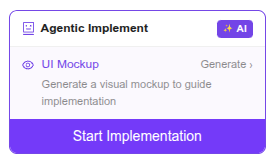
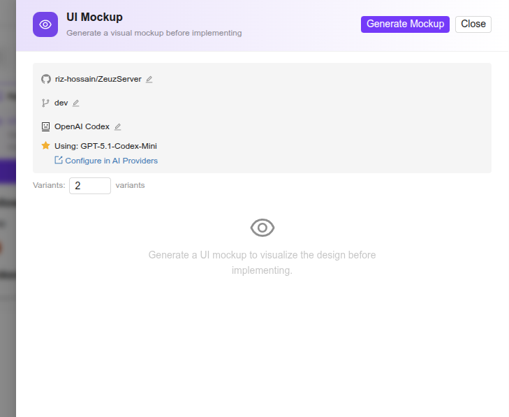
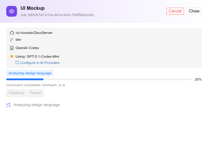
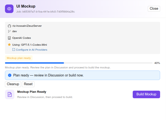
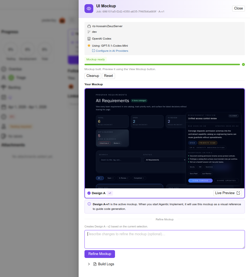
5. New Addon for Agentic Implement: UI Mockup Generator
New Features
- AI-Driven Mockup Generation: Introduced a sub-feature within Agentic Implement that creates visual HTML mockups for tickets. The AI automatically selects between a React mini-app (interactive) or HTML+TailwindCSS (static) based on requirements.
- Design Variants: Users can now generate 1–5 distinct visual interpretations (labeled A–E) per ticket to compare different design approaches.
- Iterative Refinement: Added a versioning system that allows users to refine a selected mockup via natural language feedback. Each iteration creates a new version, with a version switcher for easy comparison.
- Seamless Handoff: Completed mockups are automatically injected into the Agentic Implement planning prompt, serving as a visual reference for final code implementation.
User Experience & Interface
- Mockup Drawer: A new drawer in the project management page containing configuration tools, real-time generation progress, and a preview gallery.
- Visual Previews: Integrated thumbnail previews and a "Live Preview" button to view mockups in a new browser tab.
- Design Selection: Implemented an intuitive "click-to-select" card system to designate the active design to use as reference for implementation.
- Design Fidelity: Added codebase analysis support to extract project-specific color palettes and design patterns for more accurate mockups.
- Unified Discussions: Feedback for both mockups and implementation is centralized within a single shared discussion thread per ticket.
Agentic Implement panel with a sub-panel for UI Mockup Generator:
MockupDrawer in the empty state, with the input for the initial number of design variants to generate:
Mockup generation task in progress:
Mockup generator awaiting plan approval from user:
MockupDrawer showing a generated result card with thumbnail, preview button and the refinement prompt box:
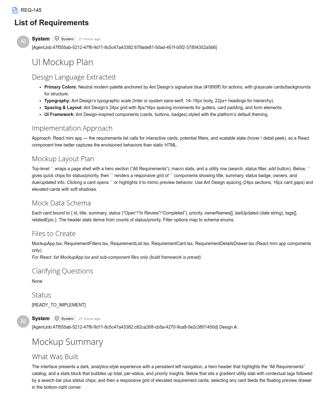
Agentic Implement system posts the mockup plan and result summary in the ticket's discussion box:
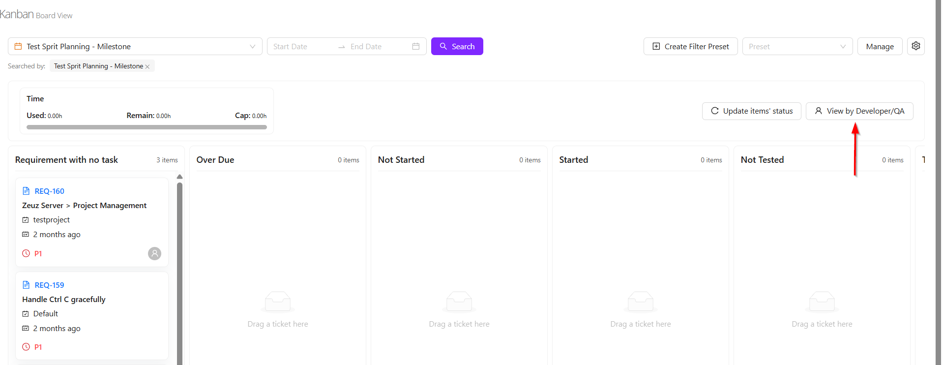
6. Milestone View's New Look
Milestone View
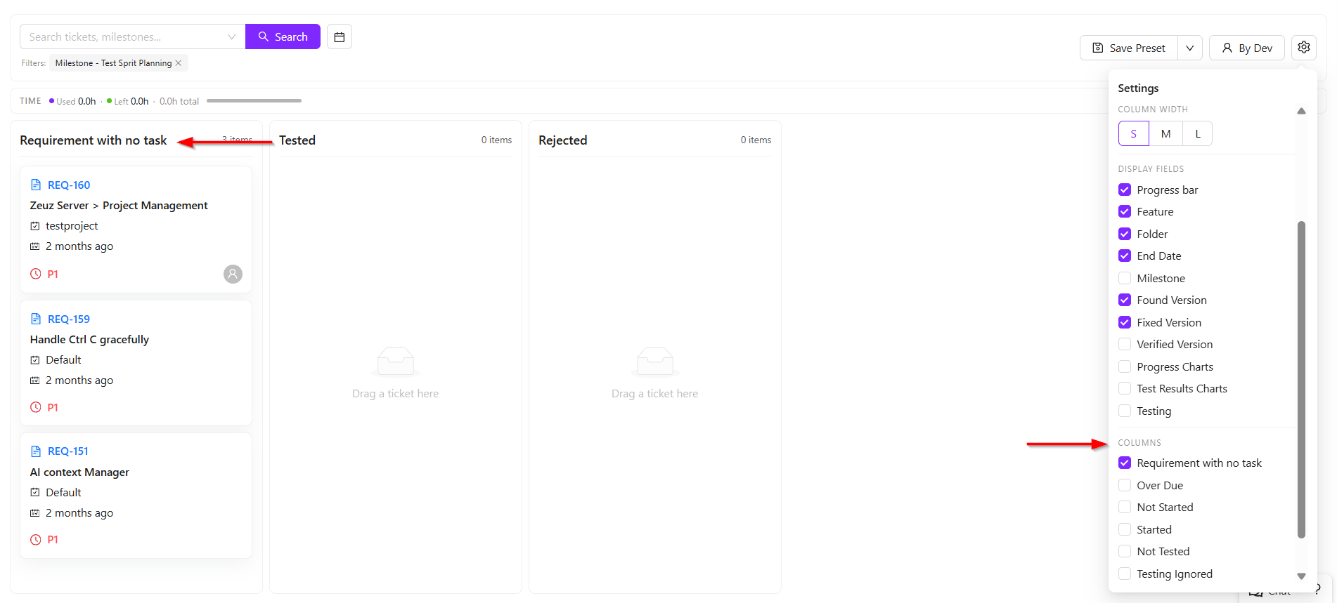
- On the Milestone View page, the milestone that was planned along with the tasks added to it can be opened and managed easily. For example, if a milestone named Test Sprit Planning was created, it can be searched directly from the Milestone View page.
- Once selected, all tasks under that milestone will be displayed across different columns. There are two main viewing concepts available in the column view.
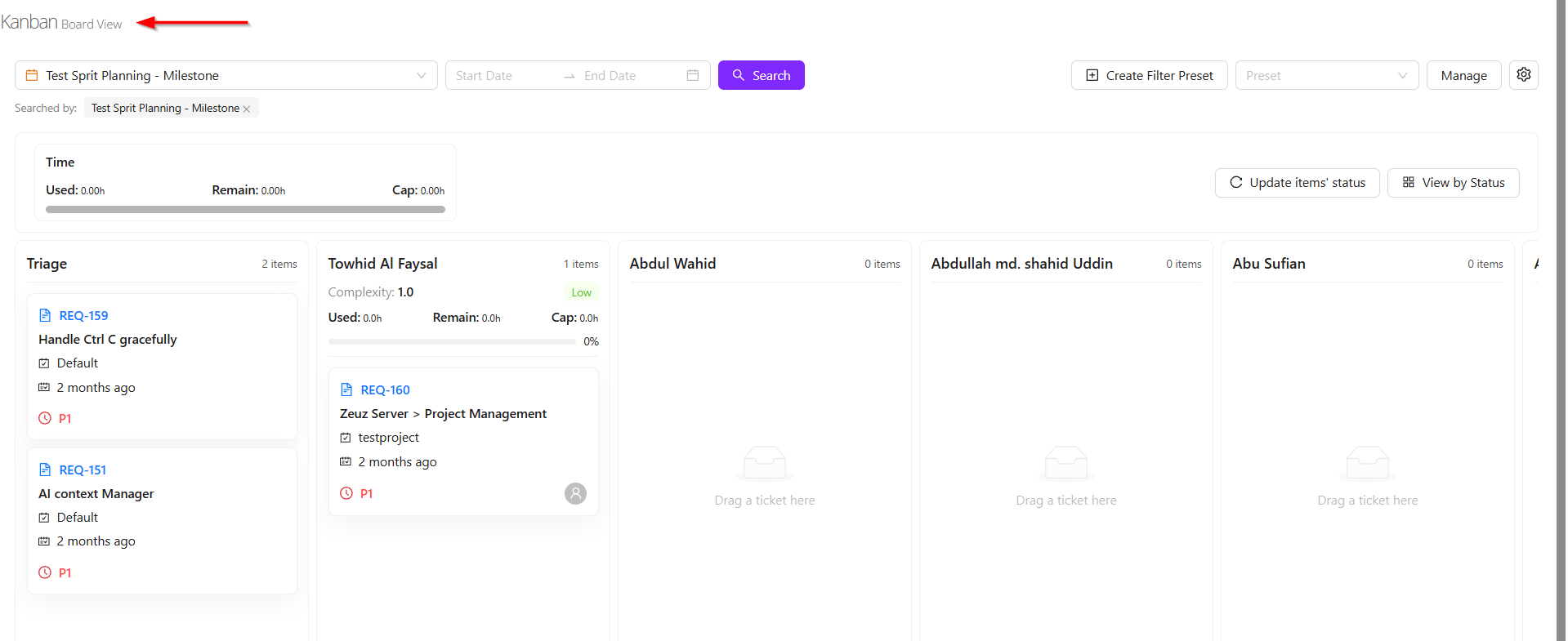
- The first view is the Status View, where tasks are distributed based on their current progress. This allows users to see whether tasks are overdue, not started, started, or not tested.
- The second view is the Developer/QA View, where tasks are grouped based on the assigned developer or QA member. For example, several tasks may be assigned to Towhid Al Foysal, while other team members may have none. This provides a clear workload distribution view.
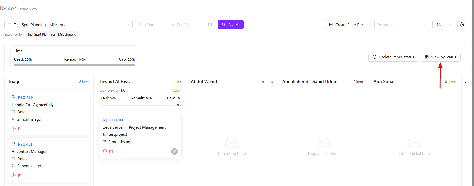
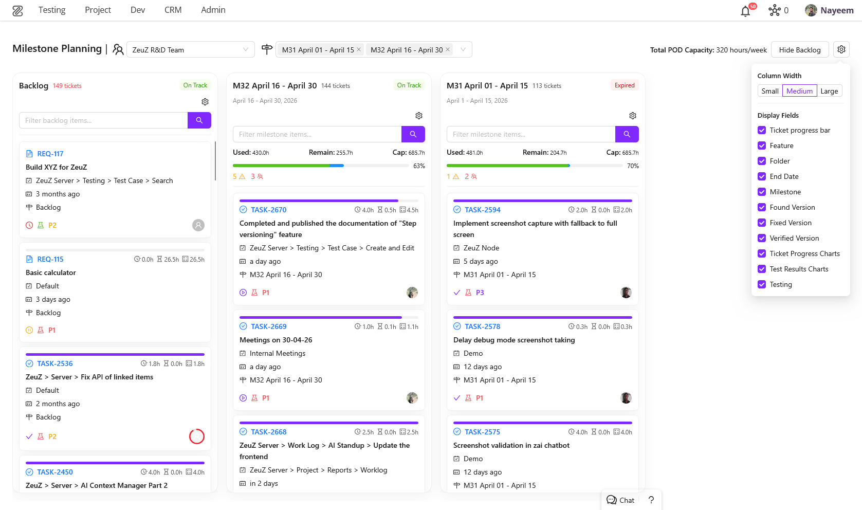
- Additional customization features are also available. Users can resize the task cards into large, medium, or small views according to preference.
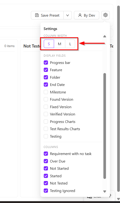
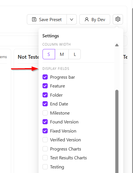
- The Display Fields option allows users to control which information is shown on each task card. For example, the title, feature name, and due date may currently be visible. If milestone information is also needed, it can be added simply by selecting the milestone checkbox. Other fields such as found version or fixed version can also be enabled as required.
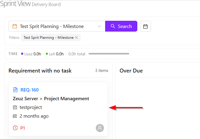
- Users can also control which status columns are visible. For example, if only the Requirement with no task tasks need to be viewed, all other columns can be unchecked, and only the selected column will remain visible.
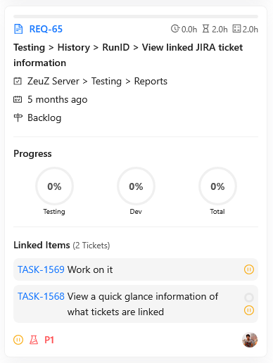
Card View
- When a card is clicked, it expands to display additional details. After expansion, it also shows whether any linked items are associated with that card.
- These linked items help users understand the task dependencies and overall progress. The progress bar available on the card provides a visual indication of the current completion status.
- For each requirement, most of the important information is presented on the card. While not every detail may be shown directly, approximately 90% of the relevant information is displayed through available filters and view options.
New Concept of Milestone View
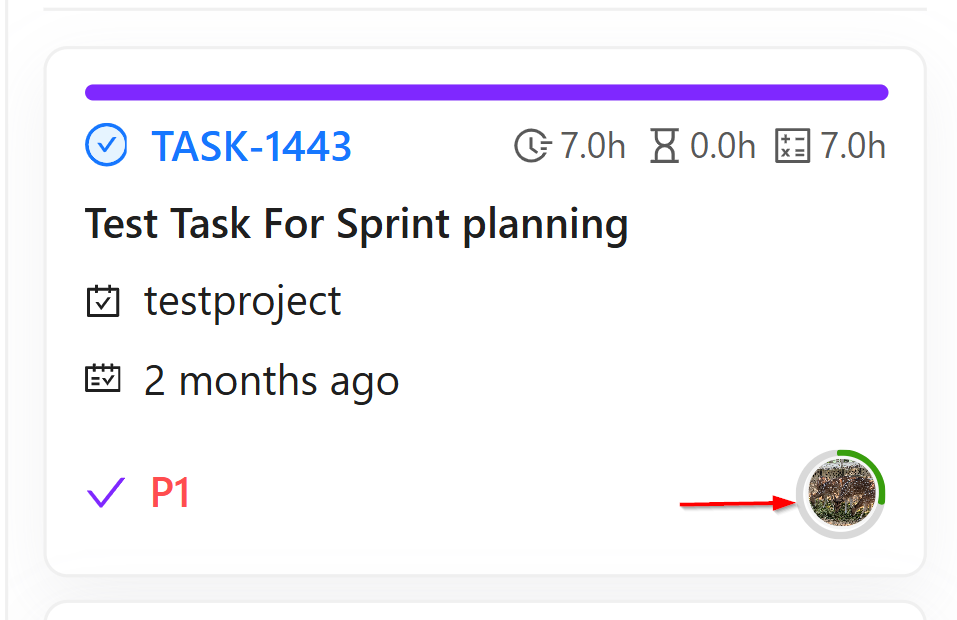
- Two new concepts have been introduced in the Sprint view system: Complexity and Risk.
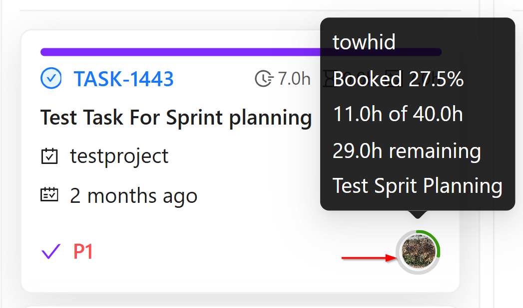
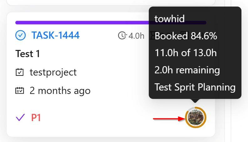
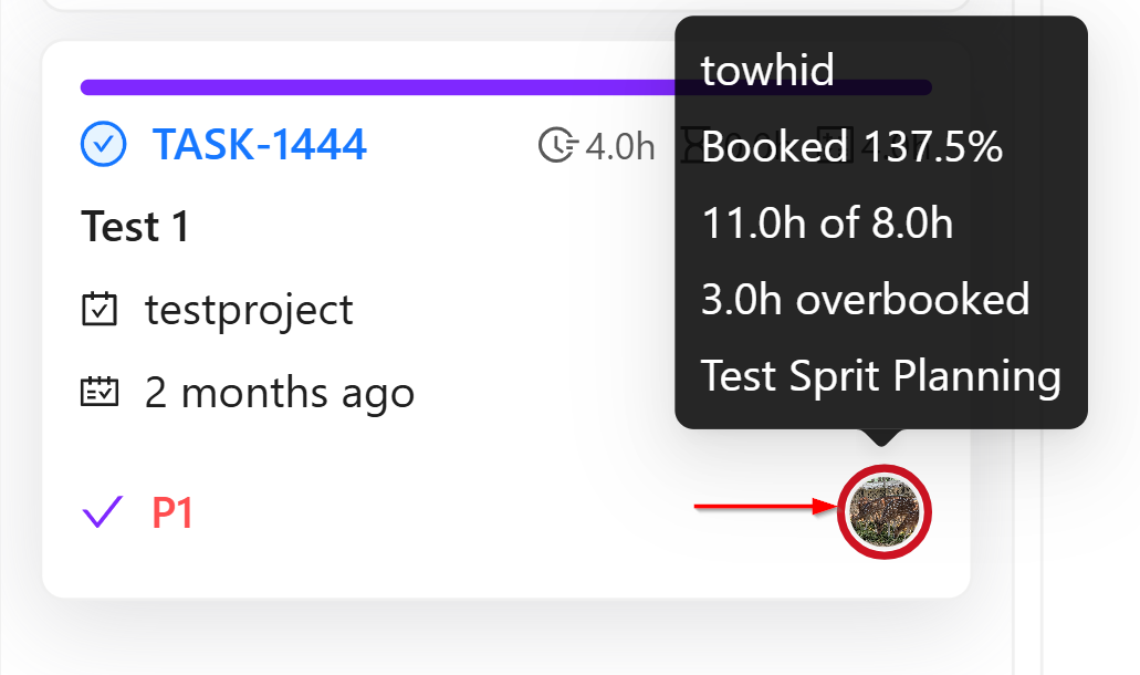
- The Risk concept is based on the working time allocated to each user. For every pod member, estimated working hours are assigned for development, testing, or other activities. Based on this allocated time, the system calculates the individual risk level for each user, which is displayed through the user's profile picture.
- When the profile picture is hovered over, detailed information appears. For example, if it shows Towhid Al Foysal booked 106.9%, it means the user is overbooked. If the display shows 13.9hrs of 13.0hrs, it indicates that 13 hours were allocated, but assigned tasks already require 13.9 hours. This means the user is overbooked by 0.9 hours, which is why the indicator appears in red.
- The risk levels are calculated as follows:
- Green — Below 70%: The user has enough available capacity and can take more tasks. Example: 10 hours allocated, only 7 hours assigned.
- Orange — Between 70% and 90%: The user is at medium risk. Additional tasks can still be assigned, but heavy or large tasks should be avoided.
- Red — Above 90%: The user is highly utilized or overloaded. Taking new tasks may not be practical.
- These colored indicators are shown on the bottom-right side of the task card to help quickly understand each developer's workload. The calculation is based on the time allocated in the pod compared with the estimated hours of assigned tasks.
-
Another concept is Global Risk. This represents the overall average risk level of all users within a milestone. For example, in the Test Sprit Planning milestone, the system combines the allocated hours of all developers and QA members, calculates each individual risk, and then shows an average percentage.
-
This global risk helps determine whether the milestone workload is balanced, overloaded, or still has available capacity. In simple terms, it provides an overview of how much work remains and whether the team's total workload is manageable, based on the combined individual risk values.
-
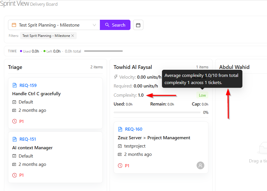
Lastly, another important feature is Complexity.
-
When a requirement is created, its complexity level can be updated. This helps measure how difficult the requirement is to complete. The complexity is rated on a scale of 1 to 10.
-
For example:
- If the requirement is very easy, it may be marked as 2.
- If the requirement is very difficult and requires significant time and effort, it may be marked as 8, 9, or 10.
-
In the Sprint view, when the display is changed to Status by Developer, the system shows the average complexity of the tasks assigned to each developer.
-
The average complexity is categorized as follows:
- Below 6: Low complexity, meaning the developer is working on easier tasks.
- 6 to below 8: Medium complexity, meaning the developer is handling moderately difficult tasks.
- 8 and above: High complexity, meaning the developer is working on more challenging and time-consuming tasks.
Velocity
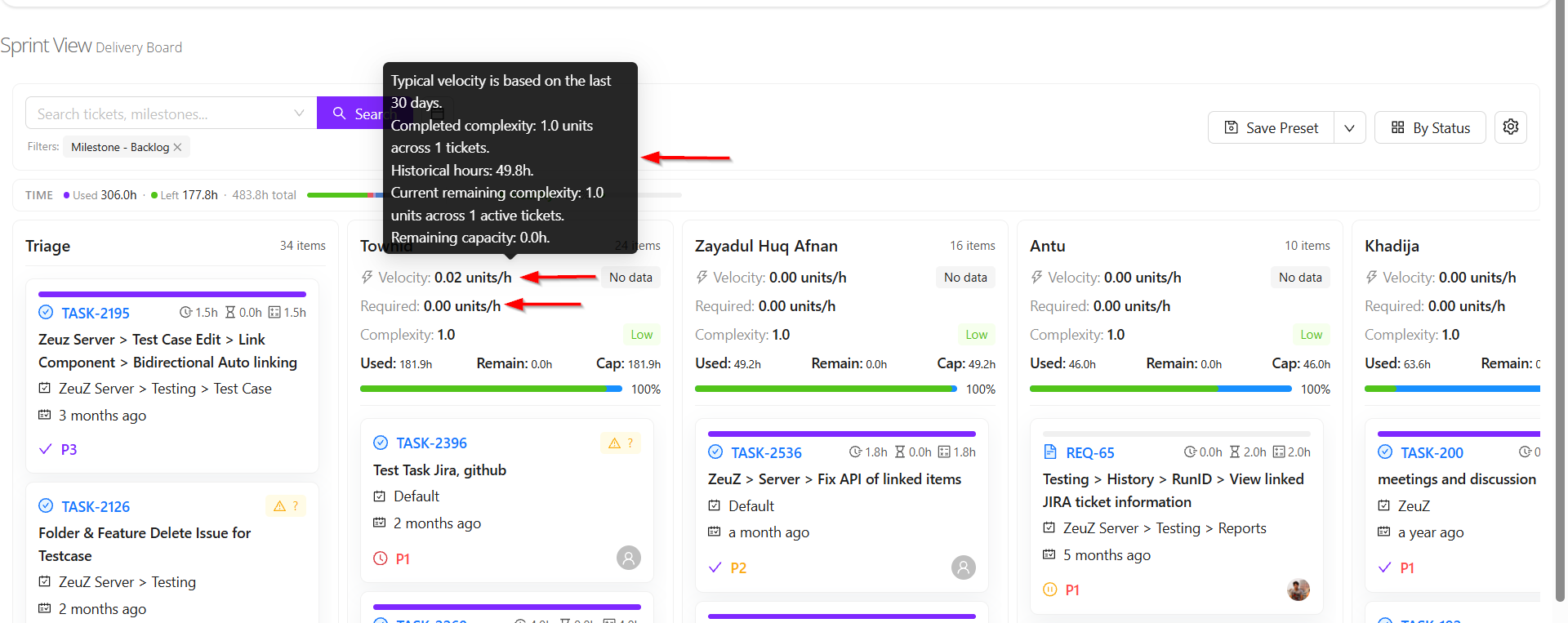
- Two concepts of velocity are available: Velocity and Required Velocity.
- Velocity refers to how much work a user can complete within a specific period and how efficiently the work is performed.
- Velocity is calculated based on the tasks a user completed during the last 30 days and the complexity of those tasks.
- For example, suppose a user completed 5 tasks with an average complexity of 8, and it took 20 hours to complete them. In that case, the user's velocity is calculated by dividing the total task complexity by the total time spent.
- This means velocity measures how much work complexity a user can complete within a certain amount of time. The calculation is based on data from the last 30 days.
- Required Velocity refers to the level of productivity needed to complete the remaining assigned tasks within the available time.
- For example, suppose a user was assigned 10 tasks and has already completed 5 tasks. The remaining 5 tasks still need to be finished. Based on the complexity of those remaining tasks and the time available to complete them, another velocity is calculated. This is called Required Velocity.
- For instance, if the user's actual velocity over the last 30 days was 2 or 3, but completing the upcoming tasks on time requires a velocity of 4, it means the user needs to increase work speed or productivity.
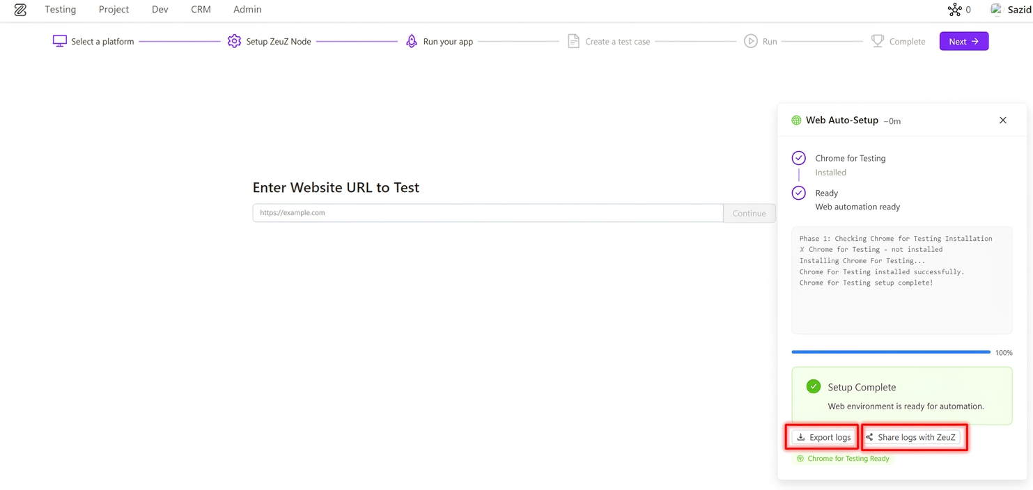
7. Log Export & Share (Phase 1)
ZeuZ has introduced a new Log Export & Share experience to help users quickly share onboarding and node setup issues with the ZeuZ team.
The new experience is available in:
- Onboarding setup cards
- Connected ZeuZ Nodes setup view on the Nodes page
What's Included in Phase 1
1. Unified Log Download & Share (Onboarding + Node Installer) Users now get the same core log actions across both onboarding setup cards and the node installer setup panel on the Nodes page:
- Export logs as a downloadable text file
- Share with ZeuZ using pre-filled email
Exported/shared logs include setup context (for example node ID, timestamp, status, and relevant setup details) so support can diagnose issues faster without requiring manual log collection.
2. Faster Support Workflow This feature reduces the time needed to report setup problems by giving users immediate, one-click log handoff options. Support and engineering teams can now receive clearer setup context without asking users to manually collect logs.
8. Time Summary for Linked Items in Requirements
We have introduced a new Time Summary of Linked Items feature inside Requirement view in Project Management. This enhancement gives teams an instant cumulative view of effort across linked items and helps project owners understand progress without opening each linked record one by one.
Highlights
1. Aggregated Spent and Remaining Time Across Linked Items Displays cumulative spent time and left time by combining all linked itmes under the requirement.
2. Structured Worklog Breakdown of Spent Time Presents spent time by work categories (such as Development, Meeting, Testing, Documentation, Research, and Uncategorized) to provide clear effort distribution.
3. Segmented Progress Visualization Presents a color-coded progress indicator reflecting the overall work completion rate.
9. Onboarding Platform Expansion – Now Live
We are extending the onboarding experience to support more platform-specific automation workflows. This update broadens onboarding coverage while preserving a consistent guided setup experience across platforms. Also Now We Added our ZAI Chatbot for Android, Web, iOS, Windows, API Testing.
Newly introduced onboarding platforms:
- API
- Windows
- Database
- Security
- Accessibility
All onboarding steps remain consistent across platforms, with platform-specific behavior primarily in the Run Your App step.
What's Included in This Update
1. Expanded Platform Selection Users can now start onboarding for API, Windows, Database, Security, and Accessibility testing.
2. Consistent Guided Journey Across Steps The overall onboarding journey remains unified, including platform selection, node setup, test case creation, and execution flow, reducing learning overhead.
3. Platform-Specific "Run Your App" Experience The Run Your App step adapts by platform to capture relevant inputs and validation context for each automation domain, while keeping the rest of the onboarding flow familiar and predictable.
Platform-Specific UI in "Run Your App"
As covered in our previous onboarding changelog, the overall onboarding journey remains the same. Across these newly introduced platforms, the primary visual and functional variation appears in the Run Your App step based on the selected platform.
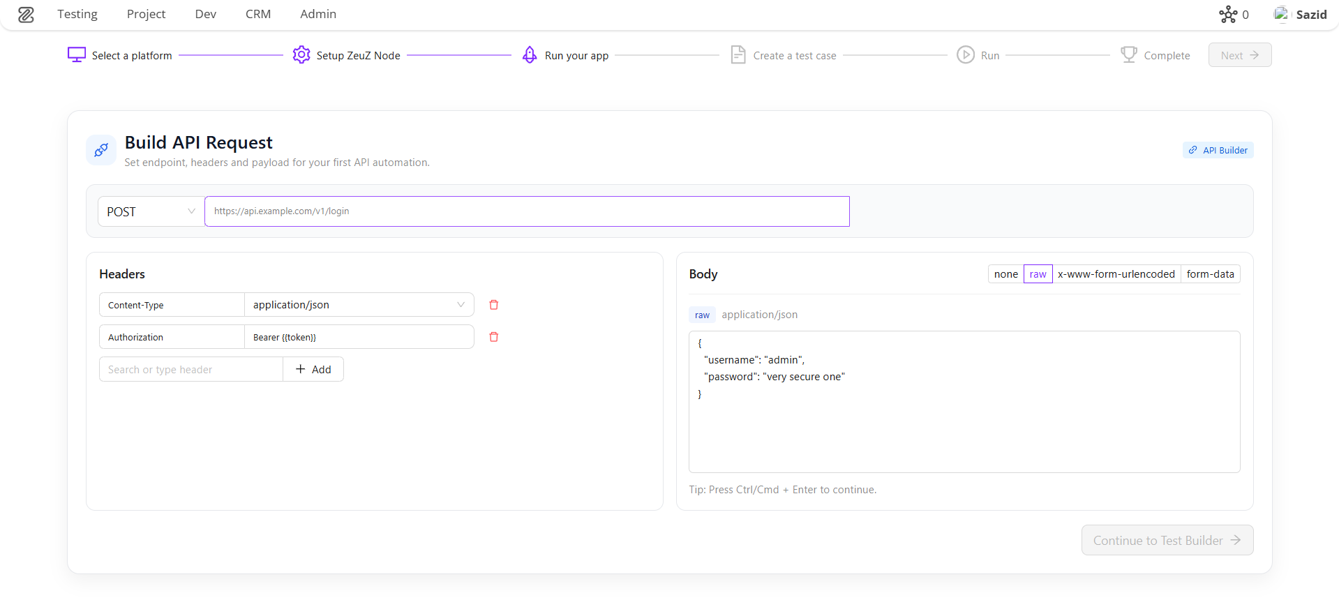
API – Run Your App For API onboarding, the Run Your App step is tailored as an API request builder. Users configure request method and endpoint URL, add headers, and define request payload format (raw, x-www-form-urlencoded, or form-data). This helps teams move from endpoint configuration to an auto-generated API test case with initial action rows already prepared, reducing manual setup effort.
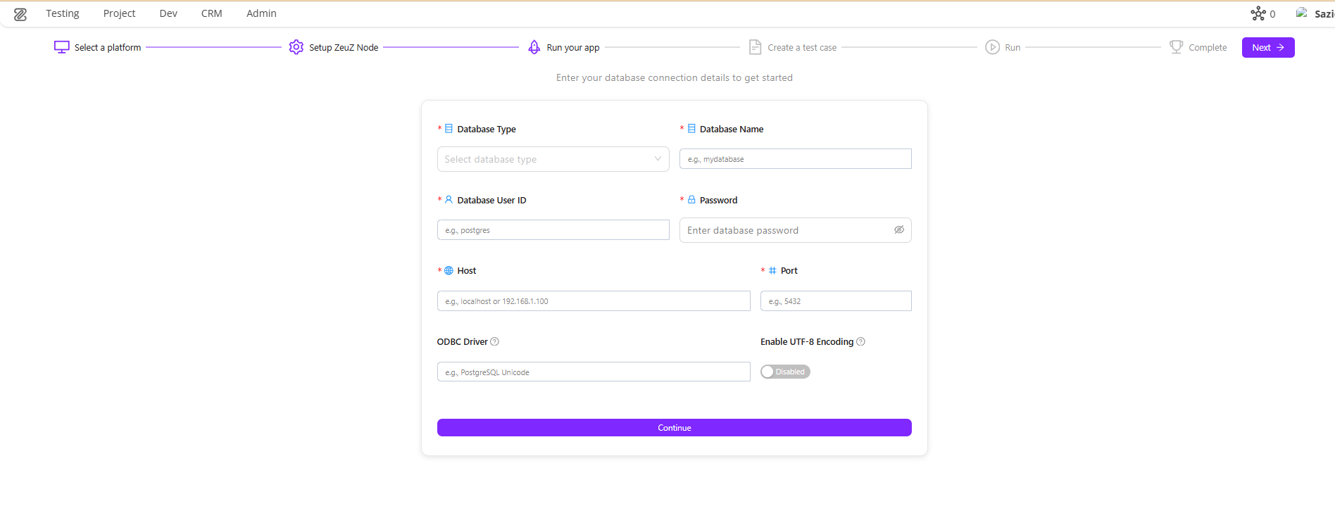
Database – Run Your App For Database onboarding, the Run Your App step is tailored as a database connection setup form. Users provide database type, host, port, credentials, and optional engine-specific settings (such as Oracle service details or ODBC options). This helps teams capture the exact connection context required to generate a ready-to-run database connection action with minimal onboarding friction.
This platform-aware behavior in a single step keeps onboarding familiar while ensuring each automation domain captures the right initial execution inputs to get started.
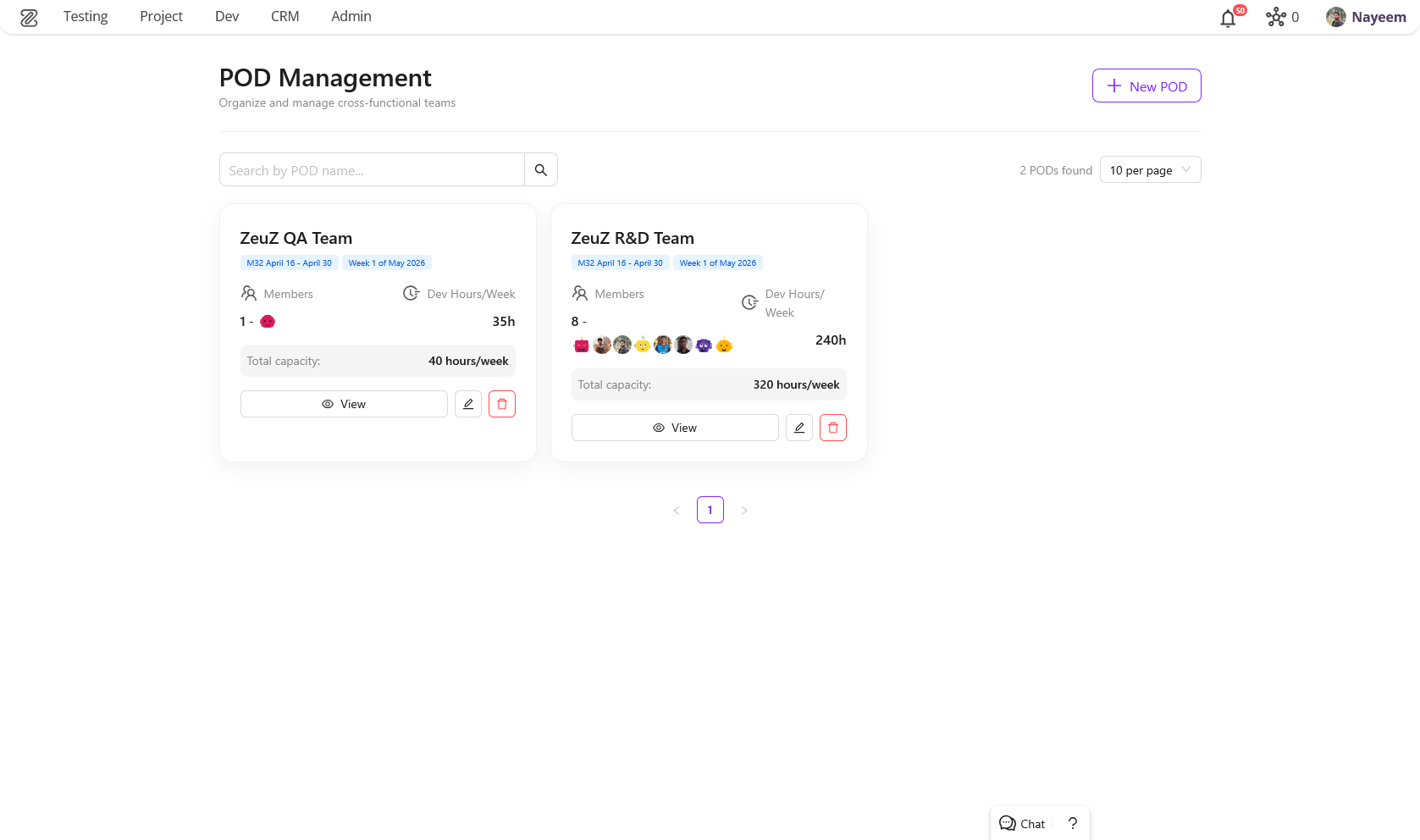
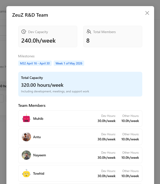
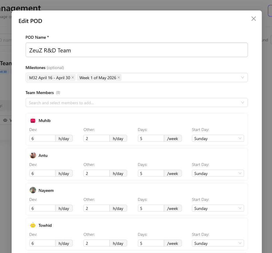
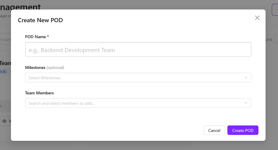
10. POD Management System Page
Introduced Product Oriented Delivery (POD) Management System for cross-functional team organization.
Core Features:
- Complete UI architecture including:
- POD listing
- Create/Update modals
- Dedicated POD view page
- Server-side search, filtering, pagination, and alphabetical sorting
UX Enhancements:
- Display of member profile pictures in POD cards
- Real-time validation to prevent duplicate POD names
11. Milestone Planning Page
- New page for efficient milestone and ticket management
- Easily move tickets across milestones (including expired → active)
- Synchronization with POD structure and planning
- Built-in time estimation handling
- Smooth drag-and-drop interface for faster operations
- Designed for long-term planning (backlog → upcoming milestones → monthly/weekly planning)
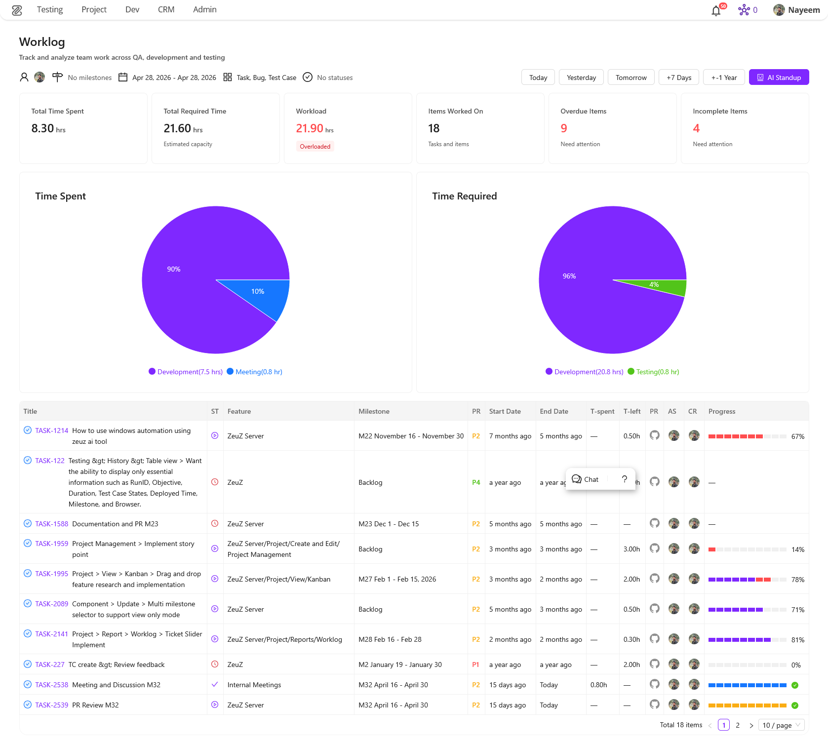
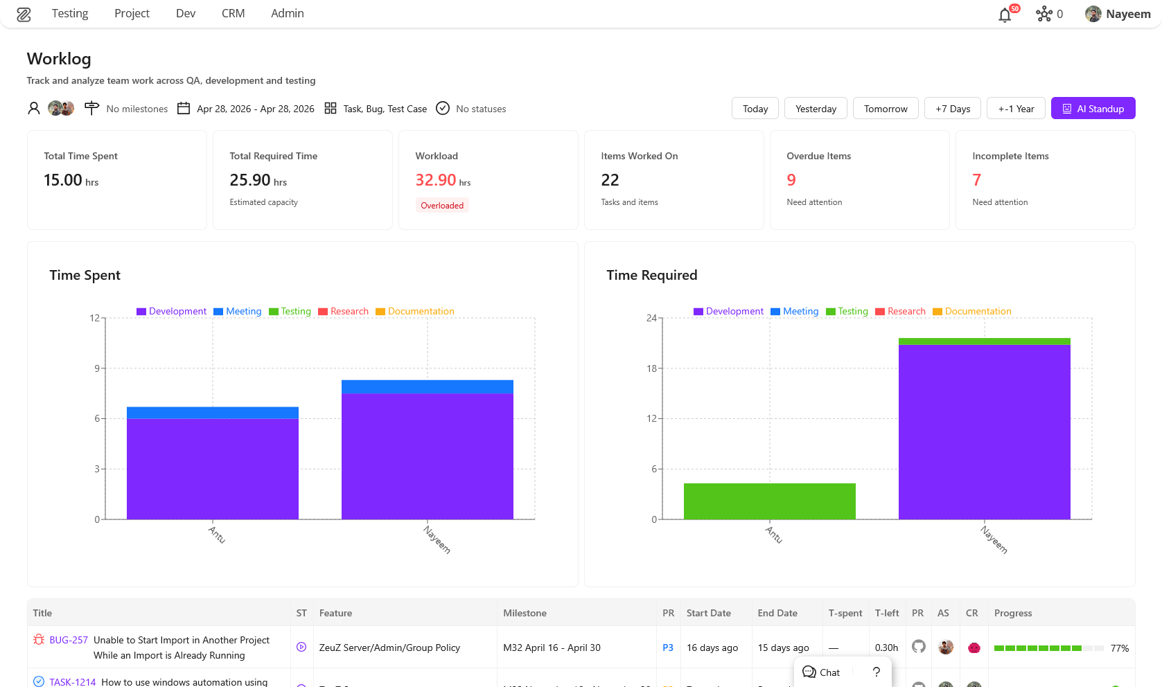
12. Team Worklog Page (Redesigned)
- Fully redesigned worklog experience with a strong focus on usability and insights
- Support for multi-user selection to analyze team performance
- Added interactive bar charts for visualizing time and workload
- Introduced ticket slider for quick navigation through tasks
- Auto-populates last selected filters for a smoother workflow
- Added key information cards (e.g., total time spent, workload, overdue items)
- Improved progress tracking visualization
- Significant overall UX improvements for faster and clearer interaction
13. New Testcase Edit Page
New Feature: Flexible Panel Layout for Test Case Editor
We have introduced a completely revamped Test Case Edit page featuring a highly customizable, drag-and-drop workspace powered by flexlayout-react. This new interface is designed to centralize testing workflows, debugging, collaboration, and AI assistance into a single unified workspace.
Key Additions
- Dynamic Workspace Layouts: Move, dock, and resize panels to suit your workflow.
- Predefined Presets: Jumpstart your testing with built-in layout presets tailored for different roles and tasks (Beginner, Debug, Android, iOS, Linux, Collaboration, AI Assistant).
- Custom Layout Management: Configure your ideal workspace and save it as a custom layout. Rename, update, or delete your custom layouts from the Layout Settings.
- Auto-Save Functionality: Your layout changes are automatically saved as temporary drafts ("Unsaved Changes"), preventing accidental loss of your setup.
- Unified Testing Tools: Integrated multiple essential tools into dockable panels:
- Collaboration: Discussions, Follow, Review, Links.
- Tools & Inspectors: Action Library, Outline, Details, Device Inspectors (Android, iOS, Linux), Versions, Attachments.
- Execution & Debugging: Debug, Logs, Run History, Runtime Parameters.
- AI Integration: zAI Chat, zAI Explain, zAI Suggest.
- Tracking: Worklog.
- Interactive Tour: Added an interactive onboarding tour that highlights essential interface areas to help new users navigate the workspace.
How to Use the Test Case Edit Page
1. Navigating the Workspace When you open a Test Case, you are greeted with a default layout consisting of multiple panels. The workspace is fully modular:
- Move Panels: Click and hold the tab of any panel, then drag it to a new location. A drop indicator will show where the panel will dock.
- Resize Panels: Hover over the border between two panels until the resize cursor appears, then click and drag to resize.
- Stack Panels: Drag a panel on top of another panel's header to stack them into tabbed views.
- Pop-out/Close: Most panels can be closed using the 'x' on their tab. Use the Layout Settings to bring them back.
2. Using Layout Presets If you are performing a specific task (e.g., debugging an Android test or collaborating with your team), you can switch to a preset layout:
- Click the Layout Settings icon in the header bar.
- Under Presets, choose the layout that matches your goal (e.g., Debug, Android, Collaboration).
- The workspace will automatically adapt to show the most relevant panels.
3. Managing Custom Layouts You can create a workspace layout tailored precisely to your preferences.
- Saving a Layout:
- Arrange the panels exactly how you want them.
- Notice the "Unsaved Changes" card in the Layout Settings.
- Click Save as…, provide a name and optional description, and save it. It will now appear under Custom.
- Updating a Layout: If you are using a custom layout and make changes to it, open the Layout Settings and click the Update with current layout (Save icon) on the layout's card.
- Renaming/Deleting: Use the Edit and Trash icons next to your custom layouts to manage them.
4. Managing Panel Visibility If you accidentally close a panel or want to add a new tool to your current layout:
- Open the Layout Settings.
- Scroll down to the Visible Panels section.
- Toggle panels on or off by clicking their names.
- Click Apply Changes. The newly enabled panels will be added to the center of your layout, ready to be docked wherever you please.
5. Interactive Tour If you're ever lost or need a quick refresher on where things are:
- Click the Quick Tour button (usually represented by an info or question mark icon) in the header.
- The tour will guide you through the Title, Debug Panel, Run Options, Discussions, zAI Chat, Worklog, and Layout Settings.
Panel Directory
The Test Case Editor provides a wide array of specialized panels. Here is a brief introduction to what each panel does, categorized for easy reference:
Collaboration
- Discussions: A chat-like interface to collaborate, ask questions, or share context with your team regarding this specific test case.
- Follow: Manage which users are following this test case to receive updates and notifications on changes.
- Review: Facilitates the review process, allowing peers to approve or request changes to the test case.
- Links: Manage and view linked items such as requirements, defects, or related test cases.
Tools
- Action Library: A searchable library of actions (pre-defined test steps) you can drag and drop into your test case.
- Outline: A high-level overview of your test steps, making it easier to navigate large test cases.
- Details: View and edit core metadata properties of the test case (status, priority, tags, etc.).
- Android Inspector: Tools to inspect Android UI elements directly while building or debugging steps.
- iOS Inspector: Tools to inspect iOS UI elements directly while building or debugging steps.
- Linux Inspector: Tools to inspect Linux environments or commands while building or debugging steps.
- Versions: Review the version history and changes made to this test case over time.
- Attachments: Upload, view, and manage files, images, or documents attached to the test case.
Execution
- Debug: Run your test case step-by-step or execute only selected actions to verify they work as expected before running full test suites.
- Logs: View real-time or historical execution logs to troubleshoot failing steps.
- Run History: See a list of past executions of this test case, including their status and duration.
- Runtime Parameters: Configure variables and parameters that affect how the test case executes in different environments.
AI Assistants
- zAI Chat: An integrated AI chatbot that can answer questions, suggest improvements, or help you write test steps.
- zAI Explain: Automatically generates human-readable explanations of complex test steps or entire test cases.
- zAI Suggest: Provides intelligent suggestions for next steps or missing assertions based on your current test case flow.
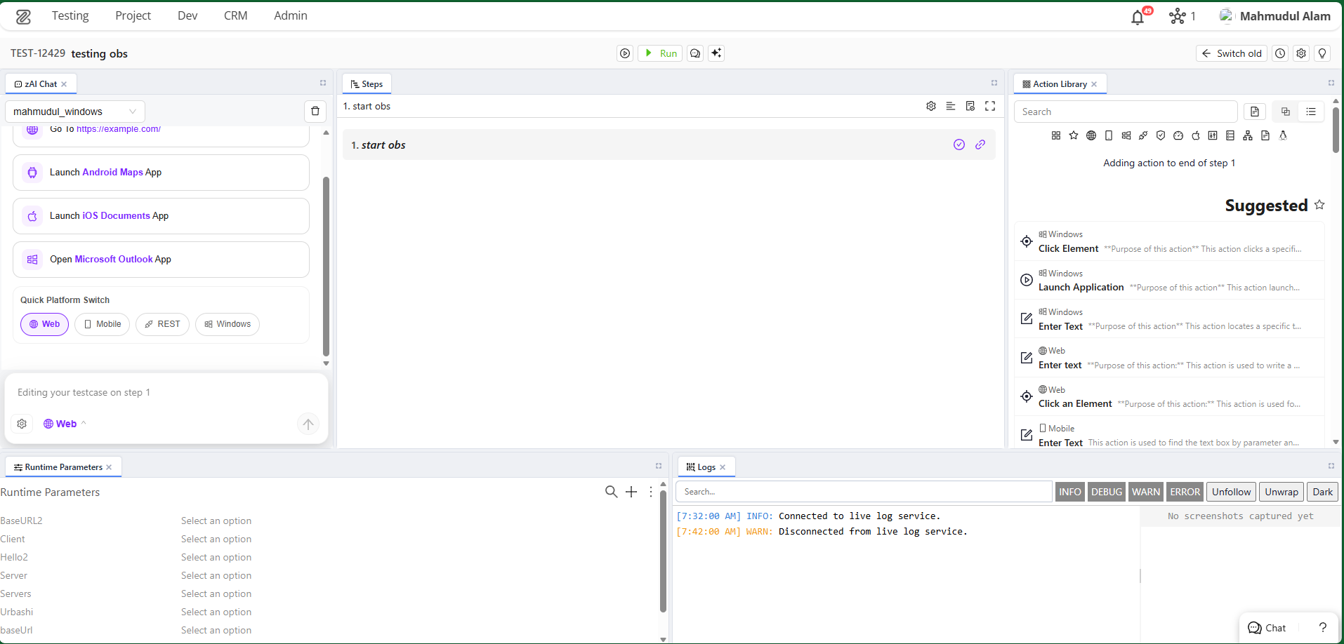
14. Linux Inspector
New Feature: Dedicated Linux Inspector Panel
We have introduced a dedicated Linux Inspector panel to streamline building and debugging automated tests for Linux desktop applications. This tool provides deep visibility into the UI structure of your Linux environments.
Key Additions
- Node Detection & Status: Automatically detects active ZeuZ nodes running on Linux machines and displays connection status.
- Real-time Screen Capture: Capture screenshots and fetch the UI element hierarchy of your Linux desktop with a single click.
- Interactive Device Screen: Click directly on the captured screenshot to select and highlight UI elements.
- Element Tree Navigation: Explore the nested DOM/UI structure of the captured screen via an interactive tree view.
- Attributes Inspector: A dedicated properties box that displays detailed metadata and attributes for any selected UI element, crucial for identifying stable locators.
- Advanced Search Functionality: Search for specific elements within the captured screen. Navigate through results using keyboard shortcuts (
Enterfor next,Shift+Enterfor previous).
How to Use the Linux Inspector
1. Connecting to a Node
- Ensure a ZeuZ node is actively running on the target Linux machine.
- Open the Linux Inspector panel. If a node is available, the inspector will automatically detect it and display the
Node IDand platform status at the top. - If no node is detected, you will see a prompt to "Start a node in this machine."
2. Capturing the Screen
- Click the Capture button (camera icon) located in the top-right corner of the inspector.
- The inspector will take a fresh screenshot of the Linux desktop and download the underlying UI element tree.
3. Inspecting UI Elements You can find and select elements in two ways:
- Visual Selection: Hover over and click directly on any UI component within the captured screenshot. An overlay will highlight your selection, and the corresponding node will be focused in the Element Tree.
- Tree Navigation: Expand and navigate through the Element Tree view on the side. Clicking a node in the tree will automatically highlight that element's bounding box on the screenshot.
4. Viewing Element Attributes
- Once you select an element, the Attributes Box will appear.
- This box reveals detailed properties of the element (e.g., IDs, classes, text content, bounds). You can use this information to create robust locators for your automated test steps.
- You can close the Attributes Box at any time using its close button.
5. Searching for Specific Elements
- Open the Search Box within the inspector to quickly find elusive UI components.
- Type in your search query to find elements by their name or attributes.
- Use the Next and Previous buttons, or keyboard shortcuts (
Enterto go forward,Shift + Enterto go backward) to cycle through the matches. The active match will be selected in the tree and highlighted on the screen.